
Grocery Gateway
Reimagining Grocery Gateway - one of Canada’s largest online grocery delivery services.
My role
Product Designer - Mobile
UX Research
Product vision and thinking
Team
V. Cheung; N. Freedman; M. Switzer; L. Zonoozi
Timeline
6 weeks
Background
Grocery Gateway is an online grocery store owned by Longo’s.
For our first industry partner project, we were given the opportunity to conduct usability tests with existing Grocery Gateway users and to redesign the My Lists online shopping feature.
How might we reimagine “My Lists” in a way that allows users to shop in an efficient manner while exposing them to new products and moments of inspiration leading to increased incremental sales and brand loyalty?
The challenge
Research Plan
With the challenge in mind, we came up with the following Research Questions:
What are the pain points (frustrations) of making lists?
What goals and motivations do people have when building lists?
How do people build their lists?
Where do people go find inspiration and new ideas?
Discovery & Research
User Interviews
We conducted 1:1 structured user interviews with two loyal Grocery Gateway users who frequently use the My Lists feature. We began with general questions regarding their experience with Grocery Gateway, and then asked the users to complete three tasks.
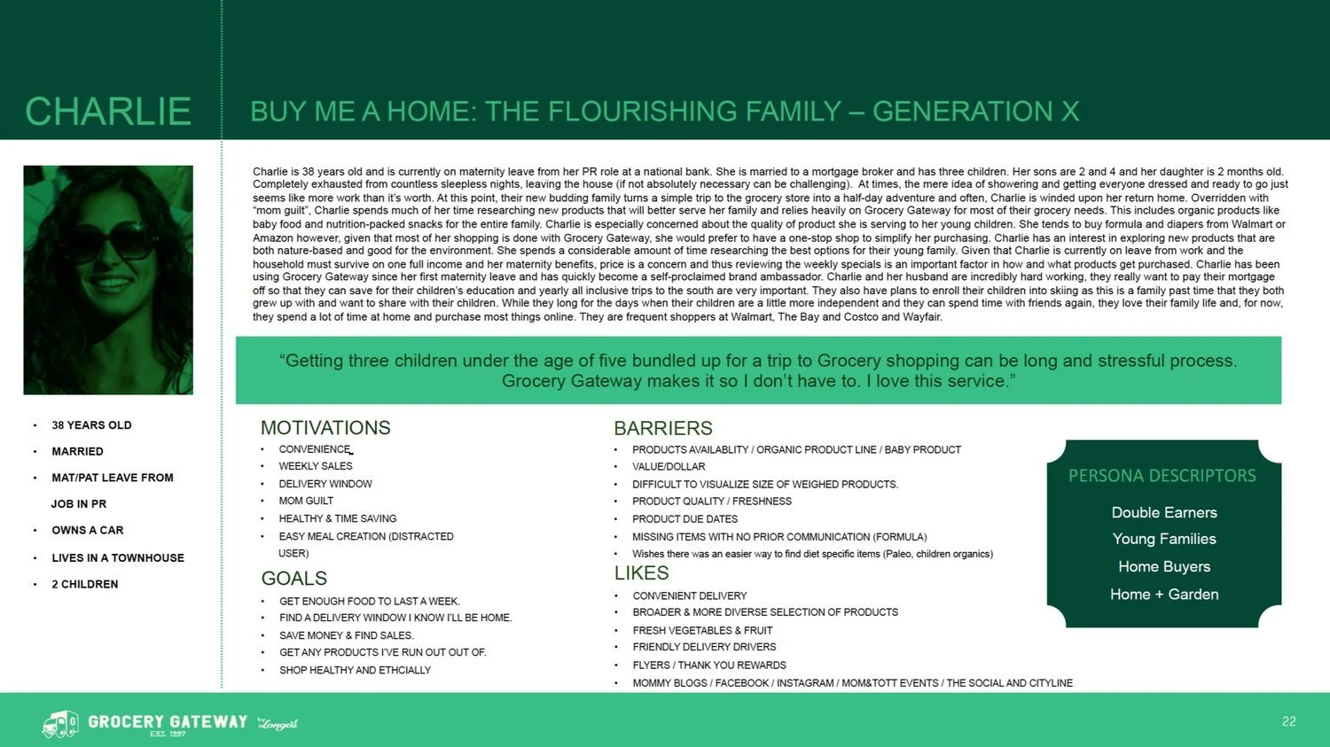
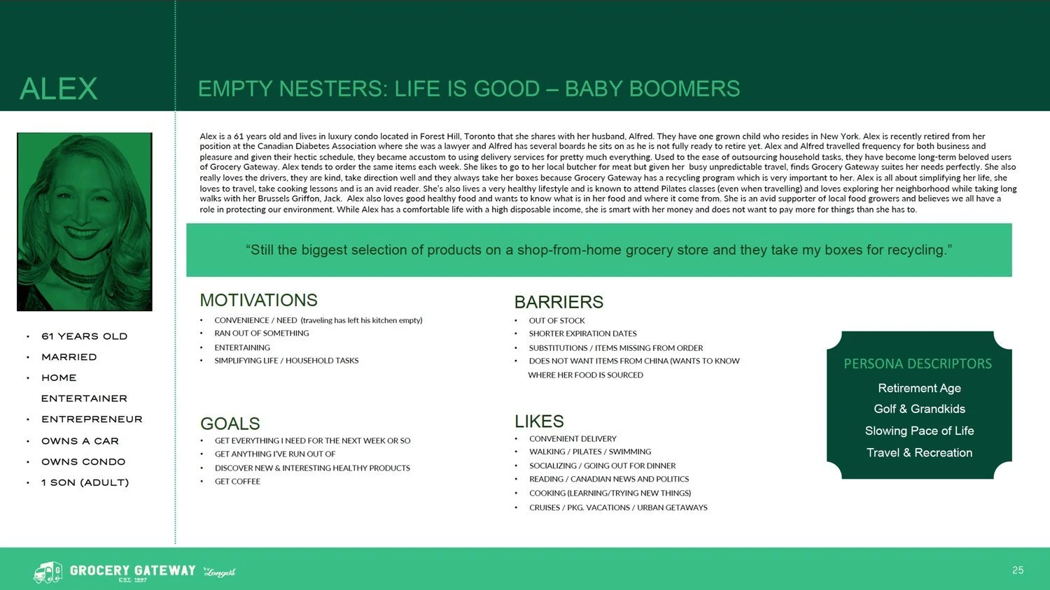
Personas
Our participants fit under these 2 personas
Analysis
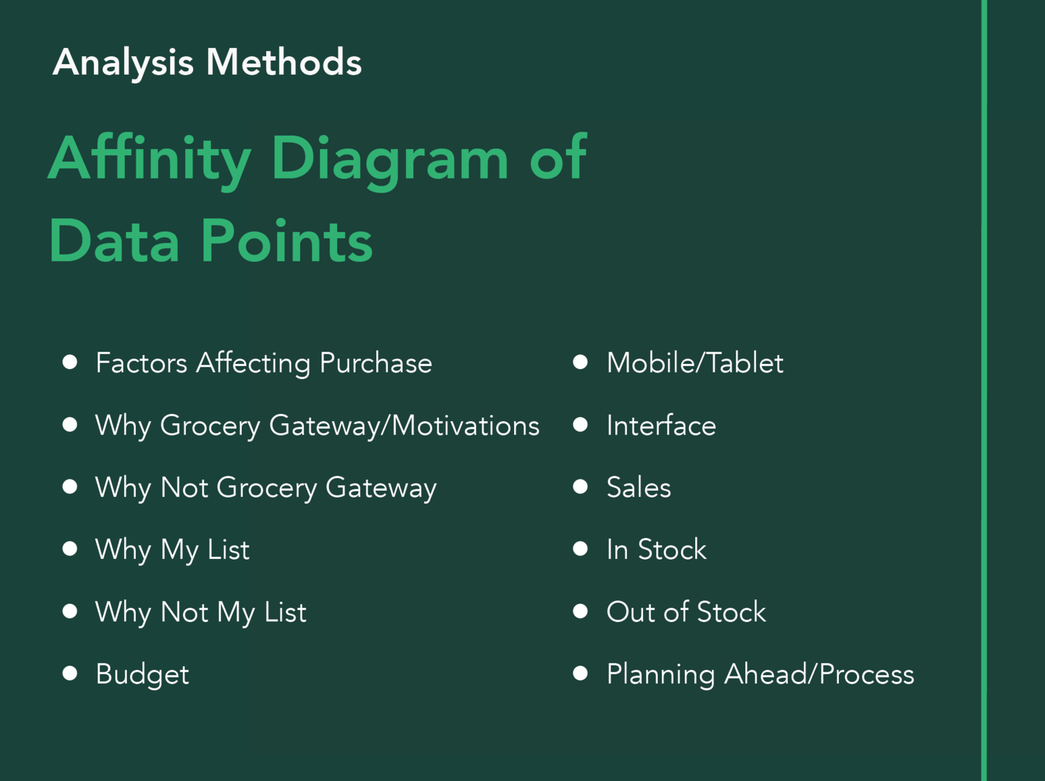
After transcribing the interviews, we colour coded each data point under the following categories:

We created an affinity diagram to visualize patterns and to draw insights. These are the clusters we generated:
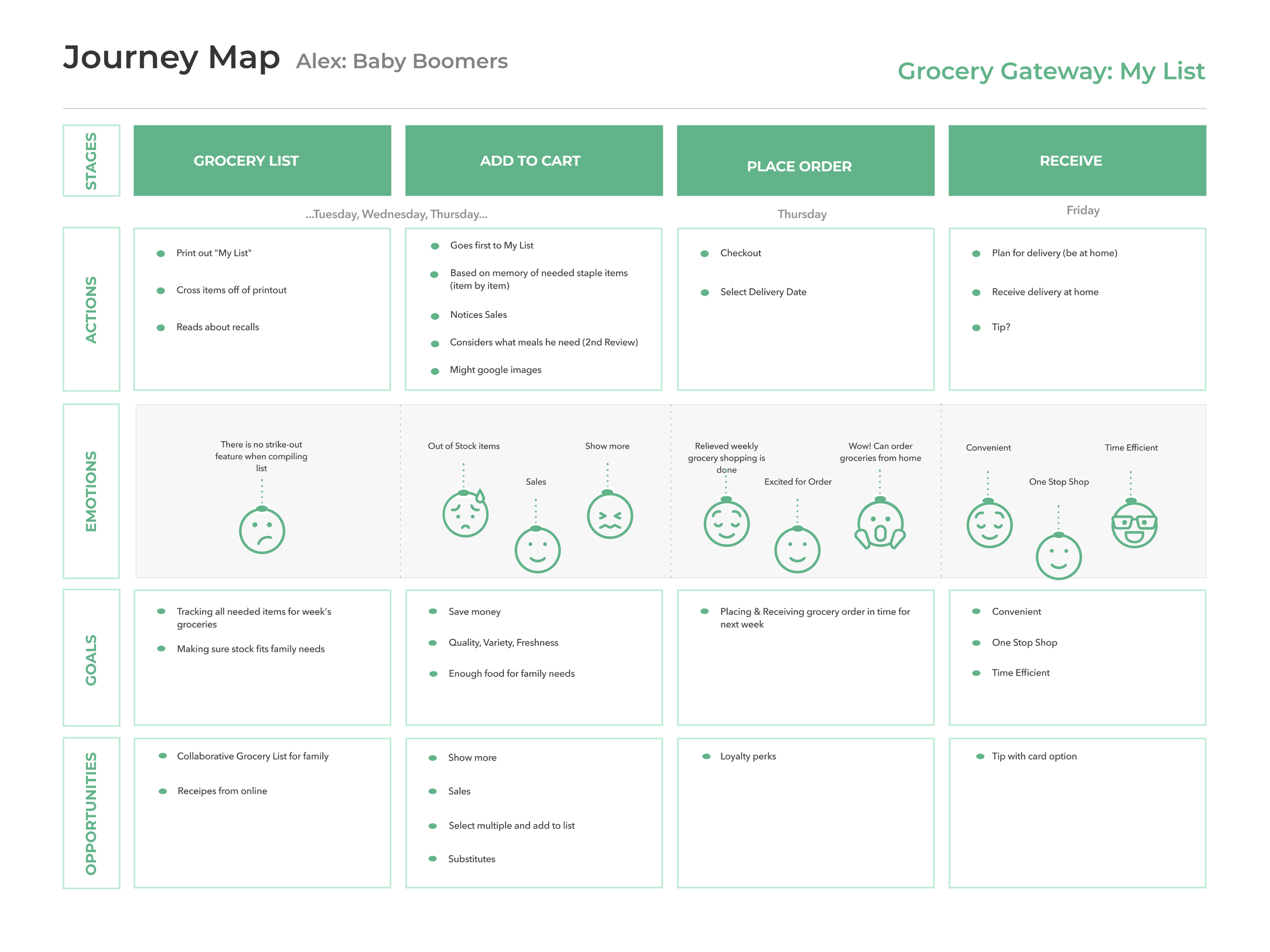
Out of Stock items disrupt and create more work for users when they are placing their orders.
Research Insights
Users place an order once a week and build their carts over multiple days by adding items from their My List to their cart.
The cognitive load required to place an order is high enough that users almost always use a desktop computer.
Users are worried they could make a mistake if they used their mobiles.
Users prefer to purchase items on sale.
They are more likely to purchase items on sale than they are to purchase items based on brand loyalty. Users will purchase on sale items even if they aren’t in need of it.
“Nothing motivates me to make a new list because I only ever like this list”
“It would be very helpful when they say out of stock that you could just link to what the substitutes would be in that category.
”
“I’m one of those guys that if it’s on sale why not save a dollar. I can just leave it in the cupboard
”
Users’ My List is their sole shopping list
They rarely alter their lists and almost never create new lists.
Even for special occasions, users find inspiration from their My List items before browsing other items.
When placing orders, users go through their entire My List item by item.
They always follow a routine method developed to fulfill the needs of their household.
Understanding the Problem
Using our insights, we created a journey map and focused on the user pain points and areas of opportunities.
Define
Brainstorming Solutions
My team and I had a brainstorming session on potential solutions. We clustered common ideas together into an affinity diagram of solutions.

Even at this stage, some of us were became very attached to the idea of Collaborative Family grocery lists and adding Online Recipes to the current online grocery shopping experience.
However after a lot of back and forth, and a Prioritization Grid to examine the feasibility and importance of the solutions.
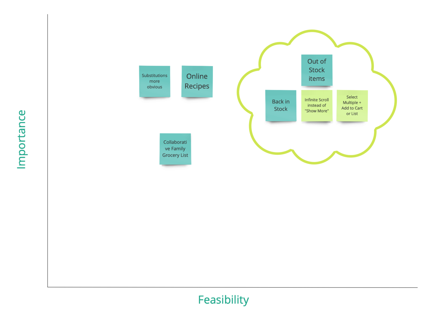
We noticed the collaborative family lists and online recipes did not really address our users pain points.
Thinking back to the challenge, we realized Out of Stock items & Substitutions were our highest priority.
We thought that it was importance to improve existing features rather than add new features that may not be used or even add confusion.
As-is Task Flow
The current task flow of a user when they encounter an out of stock item, based on our user interview.
Ideation
Prototyping
We created the desktop and responsive mobile prototype on Adobe XD.
With these research questions in mind, we created a scenario with three tasks to test our redesigned desktop and mobile prototypes.
Mobile Task: Find a substitute for an Out of Stock item and add to cart
Desktop Task: Add substitute for Out of Stock item to “My List”
Ask what “Accept Substitute” means on the check-out page
Using the Tobii Pro Eye Tracker, we tracked our user’s eye movements to understand points of interest or confusion.
How intuitive and user friendly is our design?
Do our current loyal customers find our design useful and simple?
Usability Testing
Here is a video of our tester navigating through our desktop prototype: we asked her to look for a substitution for an out of stock cheese.
Qualitative analysis
A useful tool to assess user feedback.
Click grid to enlarge
Final Redesigns
In the first task, the user did not notice the new “See in Stock Options” button, and we considered making it more obvious.
In the end we updated the out of stock banner on product images to make it more obvious, but kept the buttons the same. We felt that it was important to stay consistent with Grocery Gateway’s brand and wanted to integrate this new design seamlessly.
Retrospective
As my first industry project, it was refreshing to work within realistic parameters and receive feedback from Grocery Gateway.
It was my first time conducting a usability test for an industry partner. When we were coding the interview data, I realized there were pain points that were unclear to me. Next time, I wish I will dive deeper when the user mentioned interesting pain points, rather than moving on to the next set of questions and tasks.
Additionally, I learned that adding new exciting features is not always better for the user. Our redesign was very simple because we thought about the importance to the users and focused on relieving major pain points. My team and I actually received praise from Grocery Gateway for deciding to tackle a major problem without implementing new features that we would’ve been exciting to design.