Credit Widget Redesign
Redesigning the AutoVerify credit widget — our credit tool placed on dealership websites
My role
Lead product designer
UX Research
Product vision and thinking
Workshop facilitation
Designed the new widget
My team
Software Developers
Product Manager
Integrations Manager
Marketing Manager
Timeline
3 months
Background
Redesigning the credit widget was something that the team wanted to do ever since I joined the company in July 2020.
The credit widget is placed on dealership websites, search pages (SRPs) and individual vehicle pages (VDPs) that allows car shoppers to get TransUnion authenticated information about their credit score - this also generates a lead.
At first glance, visually, it no longer fit with our brand guidelines and it has an outdated design that looked like an ad.
Refresh the existing credit widget for existing customers with
updated branding guidelines
Reimagine the language to build trust with car shoppers and better manage expectations
Give dealers the opportunity to customize the widget so that it fits seamlessly on their website
The Opportunity
To assess the overall user experience of the credit widget, uncover user pain points when using the credit tool and increase user workflow completion.
Research Goals
Process & Planning
Research Insights
First phase: Generative research
I ran some user tests to assess the current experience of the credit widget on dealership websites, and uncovered these insights:
Looks like an ad/out of place
“would rather do his credit check somewhere else bc of the way this button looks”
“Looks like a random google ad thrown in”
Would not click unless they are 200% sure about the vehicle
Users are unlikely to click it
Users have different expectations
Users expect that they would need to put in their SIN/SSN
Users expect to see what kind of financing and interest rates
Users expect that it would direct them to their bank
Ideation Workshop with PMs and Developers
I shared the user testing feedback and dealer feedback from our Customer Success team.
With my team of developers and product manager, we aligned on the user and dealer problems with our current credit widget to an ideate on opportunities.
Workshop Takeaways
Language to reflect readiness to buy - a credit check doesn’t mean they have to make a decision on a particular vehicle
Manage expectations with clearer messaging
Remove bank logos
TransUnion branding - builds trust
Different language depending on which page (eg. SRP vs VDP)
Car shoppers
Language that targets non-prime and prime car shoppers
Custom set fonts
Custom set button to match dealer website
TransUnion branding
Dealers
Wireframes and messaging strategy

We ideated on different types of language depending on their credit type, and which page the widget was on.
Based on the user feedback, car shoppers thought they had be 100% ready to buy that vehicle before clicking the widget. We wanted language that let car shoppers know they don’t have make a decision on a particular vehicle - this was simply to help them understand their credit and financing options.
Picked the language that best fit our goals for homepage, SRP and VDP - and proceeded to test them again!
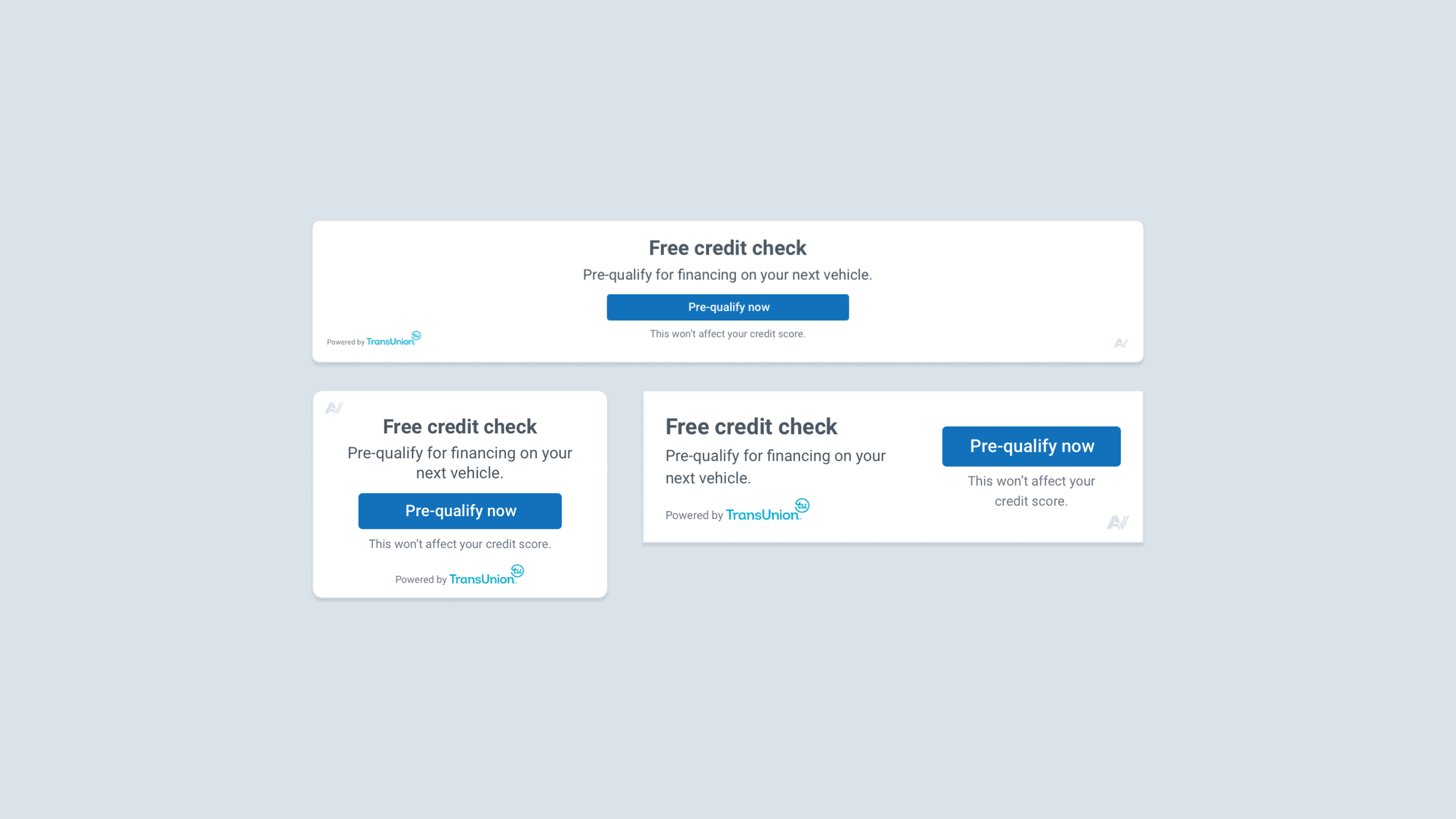
Designs
Version 1 of the redesigned credit widget - different sizes to accommodate different pages and spaces on dealership websites.
To assess and validate the language and concept (understandability and desirability) of the redesigned credit widget on a dealership homepage, VDP and SRP.
Research Goals
Second phase: Validation
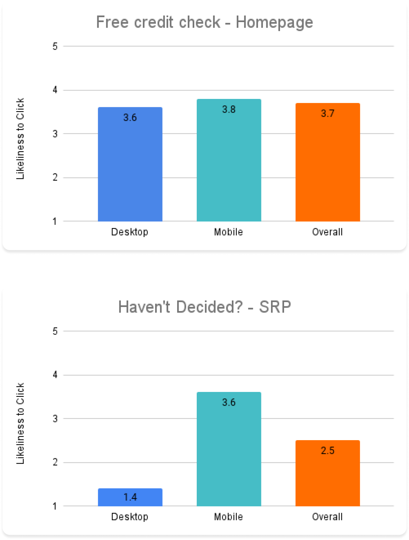
Likeliness to click & Expectations
Screens to test
I ran some user tests and asked users to rate their likeliness to click if they were interested in buying a car and about their expectations of what would happen after clicking the widget for understandability.
Homepage vs. SRP
Research Synthesis
Grouped key positive insights and negative insights based on test results.
The widget on the homepage (full width) had a higher likeliness to click than the SRP (small widget at the side)
There’s a negligible difference between SRP and homepage on mobile - widget is always full widget on mobile screens.
Users like the messaging that it’s free and won’t affect their credit score.
Users who rated “very likely” said the banner stands out well & looked like it was part of the page
Research Insights
Second phase: Validation
Users’ expectations of what would happen are generally correct: providing personal details for a credit check
Looking at the SRP on desktop, users say it looks like an ad
”I’m used to seeing ads on the left & right, and smaller font, haven't decided language not that attractive”
“less likely than first one - first one took up a lot of space, when it's off to the side like this one, it looks like an ad”
Final Decisions & Designs
Designs
• Advocate for full width
• Stick with one messaging across all page types for first iteration
• Avoid putting widget in sidebars
Impact & Lessons learned
Placement on websites largely determines whether users will think it’s an ad - the more space it takes up, the less likely it looks like an ad
Some dealer feedback that there is still too much white space in the full width versions - feedback to take back and iterate on
Dealers very excited about different sizes, custom fonts, button colours and round vs square corners
Developers really enjoyed the process of being part of the ideation workshops - this helped them understand the why behind product and design decisions and created alignment in the team!